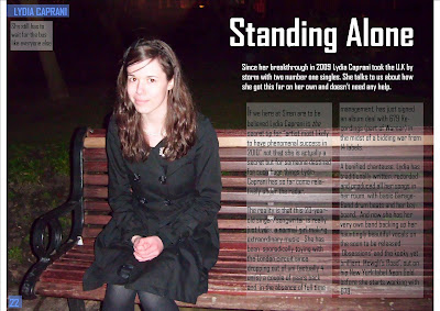
 This is my double page spread for my music magazine. I have tried to keep the same colour scheme as the rest of the magazine with the page number and heading in the top left corner. Apart from that I have kept the colour at a minimal so it is easy to understand and the main image still stands out. The black and white also stand out more against the dark background and white text boxes. I have put the text in white text boxes but kept then fairly transparent so the bright white doesn't take attention away from the darker image and make it look unprofessional.
The main image of the artist is on separate page which is a usual for the double page spreads I have analysed. But my image also takes up both pages but only one has the artist on so the writing can be put on the empty side. I have darkened the background on photoshop as it is unimportant to the image and makes it easier to see the white headings. I have also made the artist brighter so she stands out more against the black backdrop. I have also included a caption in the top left corner which has to do with the focus of the article so it does not look like the image is there randomly.
No comments:
Post a Comment