My music magazine uses forms and conventions of the magazines I analysed for my research and planning. In my research and planning I analysed three different music magazines which were The Word, NME and Kerrang to establish the conventions and features in them to use in my own music magazine. For my front cover I included a small ear in the top right corner box which I used from NME and The Word magazine. I have all the conventions which are seen on the front splash of all music magazines I analysed to make sure my magazine looks professional. My masthead stands out from the main image background as with other music magazines with its big font size and bold colour. My cover lines are displayed down the left hand side of the magazine so when it is displayed on a shelf the names of other bands will be clearly seen to attract a larger audience.
I designed the editors letter based on The Word for my contents page. The letter from the editor makes the magazine seem more personal and friendly as the editor is directly speaking to the reader. I also used the main image on the contents page from NME to complete my own contents page. My contents index is clearly displayed and set out into sections to make it easier to read and for the audience to find what they are looking for.
I used the idea of a main image taking up both pages for my double page spread from Kerrang and NME which is a convention of double page spreads. It was mainly inspired by NME because I used a slightly transparent box for the text as NME did for their double page spread. The article is set out in columns which is another convention of magazines.
The ideology of my music magazine is to focus on new upcoming bands so the social groups it represents are people who are very up to date with the latest music and enjoy searching for new bands. The ideology is that the music is the most important thing and not the bands image. This is made clear from the choice of bands I have referred to as they are all new bands that only people who are keen on new music will have heard of. The social group will be primarily young people as they most commonly go to small gigs and typically most interested in upcoming bands. The magazine represents this social group as passionate about music and that they enjoy going out and having fun with friends.
Smaller and more independent media institutions may distribute the magazine as bigger mainstream institutions focus on profits so want big bands to feature. Independent institutions are more likely to think of the quality of music they are covering rather than just how big the band is at that moment in time. I would choose the publisher Development Hell LTD to distribute my magazine. They are UK based independent magazine publisher who own and distribute such magazines as The Word whose genre is classic rock and entertainment and Mixmag which covers dance music. I feel like this would be the right institution to choose as they have experience with music magazines but haven’t done the indie rock genre which my magazine covers so it opens up a new market for them and potential for profit.
My main target audience will be young adults and students aged between 16-25, as students have more knowledge of new bands and are more likely to attend small gigs and concerts. This means they will be more interested in the music scenes described in the magazine and explore them further. Young adults also have the element of disposable income and as they are all mainly music fans they will spend their income on music magazines. The audience share the same ideology as the magazine that music is the most important thing with bands and artists. The target audience is for both men and women as both can be just as passionate for new music which is what the main focus of the magazine is. The magazine will help build a community around supporting local bands so the audience will feel that the magazine cares about smaller bands which will make the audience feel like they can trust the magazine. If fans care about their favourite bands they will care about the magazine which promotes them.
I attempted to attract my audience on the front cover through mise-en-scene by using bright colours which will make it stand out on a shelf as most music magazines use a lot of black and darker colours. The masthead stands out the most as it is on a white background and has a bold outlining so people will remember the name of the magazine. I think my magazine will appeal to my target audience from the bands mentioned on the front cover and on the contents page. My cover artist’s genre is electro rock which is popular within the indie scene at the moment and so this shows the magazine is up to date and fresh.
I have learnt to use Photoshop whilst making my college and music magazine which I have used for editing my images and creating my contents page and front cover. I learnt how to use layers so images and text can overlap and create gradient effects for the background which make it look more professional. For my double page spread I used Microsoft publisher as it was easier to get the right dimensions and it was more suitable as the double page spread is mainly text.
From my preliminary task I learnt that I need to plan where everything is placed on the page in advance as for my college magazine I just put all the text around the image where it would fit. With my music magazine I thought more about my main image and where it would fit in relation to everything else when I took the picture. I used my college magazine to practice using Photoshop so when it came to my music magazine I could use the tools easier and to a greater effect. I also learnt to manage my time better and not leave everything to last minute which I am not doing with my music magazine. From the preliminary task I learnt about the conventions of magazine covers and the terminology to use so it could use it more naturally when it came to my main task and was used to analysing front covers of magazines for it.
Thursday, 25 March 2010
Thursday, 18 March 2010
Final Double Page Spread
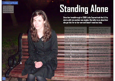 This is my double page spread for my music magazine. I have tried to keep the same colour scheme as the rest of the magazine with the page number and heading in the top left corner. Apart from that I have kept the colour at a minimal so it is easy to understand and the main image still stands out. The black and white also stand out more against the dark background and white text boxes. I have put the text in white text boxes but kept then fairly transparent so the bright white doesn't take attention away from the darker image and make it look unprofessional.
The main image of the artist is on separate page which is a usual for the double page spreads I have analysed. But my image also takes up both pages but only one has the artist on so the writing can be put on the empty side. I have darkened the background on photoshop as it is unimportant to the image and makes it easier to see the white headings. I have also made the artist brighter so she stands out more against the black backdrop. I have also included a caption in the top left corner which has to do with the focus of the article so it does not look like the image is there randomly.
Tuesday, 16 March 2010
Double Page Spread Photos
I was unhappy with my pictures for the double page spread so I took some more at the weekend. I made from landscape so they can cover the full double page spread and text can be written over the top of it. To do this I have kept Lydia to the left of the picture so the right side is empty so text can be clearly displayed without blocking anything. I will be using the second picture as the first one becomes too blurry when larger so it would look unprofessional and would reflect my music magazine. The second one is closer up so she will take up the full left side as she is the main focus of the article and it is not blurry so is the most suitable.


The images connotate that she is relaxed and a 'normal girl' even though she makes popular music which is also portrayed in the article. She is looking directly into the camera to show she is confident and happy with what she is doing.


Friday, 12 March 2010
Final Contents Page
 I have kept the same colour scheme as the fron cover but used mainly blues instead of purple so it isn't excalty the same. I put all the elementsof a contents page together including a big image, letter from the editor and subscription box. I have divided the actual contents into different sections to make it easy for the audience to find what their looking for. I have included the page number which corresponds to the main image which advertises the page and the rest of the magazine. The letter to the editor makes the magazine more personal and makes it seem friendly and welcoming. The subscription box is in a bold red which makes it stand out from the rest of page so the audience will notice it more and it will persuade them to subscribe.
Final Front Cover
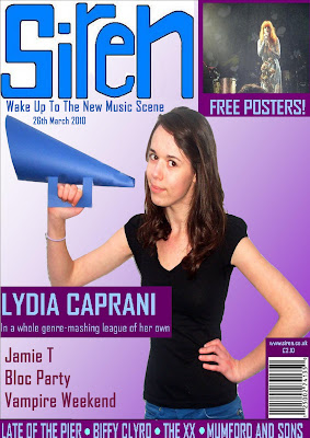
Here is my final front cover. I have altered the background of the main image to make it look more professional and it still matches my colour scheme. I have all the features of a front cover of a music magazine like a masthead, main and smaller coverlines, date line and also website and price.
I have kept the same font throughout so i doesn't look too messy and have spaced out the different coverlines so the cover looks neat and the information is clearly displayed. I have made my image bigger so it takes up the most room and is the main focus of the cover as before the masthead was the first thing I noticed when I looked at the magazin cover.
Friday, 18 December 2009
Rough Final Front Cover
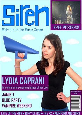 Here is my final front cover for my music magazine. I have included all the conventions of a music magazine front cover such as a masthead, coverlines, slogan, barcode and others. I have chosen a simple colour scheme and used it in the font and my main image. I have also kept the same font so the magazine looks simple and neat.
 For my final cover I want to change the background using photoshop and maybe make the image slightly larger so it takes up somemore room at the top of the page
Thursday, 17 December 2009
IT Drafts
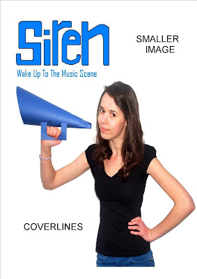

Here are my IT drafts for my three pages. I now know how I am going to make my final front cover and contents page and have chosen the photos.I have only shown my main image photos so far but I know what images I am using for my smaller stories on the front splash and contents page. All the images I am using are my own which I have took at various concerts. I am confident about where I am placing things like cover lines and bar codes. But I am still unsure how I am setting out my double page spread. I need to choose a final image and a headline which matches the representation of the artist I have created on the front cover.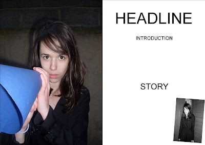

Subscribe to:
Comments (Atom)