
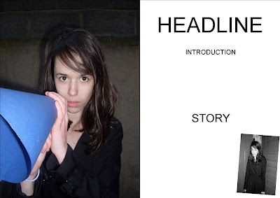
For our preliminary task we had to create a college magazine cover and use a medium close-up shot of a student and include appropriately laid-out text and masthead. I started by analysing two existing college magazine covers and highlighting the main features of a college magazine. From this I could decide what to include on my front cover and begin planning. Like most magazines I included a masthead, coverlines, main image and date line.
I think a strength of my cover is the colour scheme. I used the same colour scheme of other Wyke booklets so the magazine is recognisable as a product of the college. The purple can be used for bold titles and the green is brighter so can be used to highlight smaller coverlines. To show that is also from Wyke college I used the logo of a white and green arrow as bullet points to list my coverlines. I also think by using bullet points my coverlines are neatly displayed and are organised. This also shows the college expects students to be organised.
I think another strength is my main image. The student is portrayed as a model student as she is carrying books with her and looks like she is ready to learn. She is also an ethnic minority and gives an ideology of the college of that anyone can come to the college if they are willing to learn and that the college promotes diversity. In the background is a picture of the college. I chose this part of the college site as it is a key meeting area for students so will be clearly recognised as part of the college. The picture of the model and the college were taken separately and I used Photoshop to cut out the picture of the student and paste it onto the backdrop. I also changed the colours of the backdrop to make the day look sunnier by increasing the colour. This makes the image and magazine look more appealing to readers.
One of the problems of the design is where the coverlines are placed. I spent a lot of time trying to have them in the correct position so they are easy to read and doesn’t attract too much attention away from the main image. I am still not totally happy with positioning of the main coverline as I think it may be hard to read for some people as lots of colours overlap it in the background. For my music magazine cover I want to think more clearly about where the main image is placed so I have enough room for the coverlines, rather than just try to fit the text around the image.
My magazine cover compares quite closely to the two I researched as I have two colours in the title separating the two words which is used in the second magazine I analysed. I also used the left third of the splash to display my coverlines like in the first magazine, so if the magazine is stacked with others the majority of the coverlines can still be read.
I think my cover attracts its target audience of student of the college because of the use of a student as the main image and the coverlines. My coverlines are of academic and social events happening at the college so attracts the majority of students. I think it represents students by having both sides of student life and showing that is like that.
Overall I think I planned out my time well by using one week for research and planning and the last week for putting together my final design and writing my evaluation.
 Here is my final front cover for my music magazine. I have included all the conventions of a music magazine front cover such as a masthead, coverlines, slogan, barcode and others. I have chosen a simple colour scheme and used it in the font and my main image. I have also kept the same font so the magazine looks simple and neat.


