 The final music magazine I am analysing is NME magazine. NME's ideology covers old and new alternative music. But they mainly focus on indie rock as well as covering genres such as dance and hip hop. The magazine is targeted at the mainstream audience of 14-25's and has a wide appeal as it covers many genres.
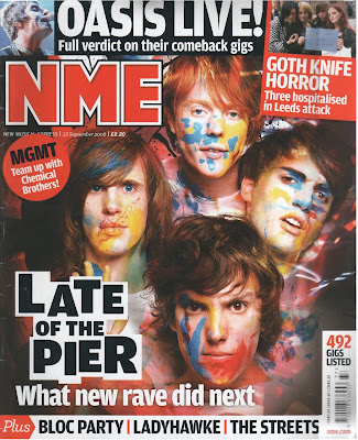
The masthead is the title and logo of the magazine and has the biggest font on the page to stand out the most. It is in a bold red surrounded white which surrounds each letter. This emphasises and makes it stand out further. This also sets the colour scheme of red, white and black.
The main image is of the indie-electro band Late of the Pier and this photo makes them look creative, confident and fun. They are looking directly into the camera, like in my other analysis's, to engage the reader and show their confidence. The band are covered in paint which suggests they are creative and also shows a fun side to them. The paint could also show they are not afraid to break the rules and get dirty, which is reflected in their alternative music.
The main cover line states the name of the and clearly in black against a white background to make it stand out more. The individual letters on the cover line are placed separately and aren't in a straight line which again shows the band are fun and aren't afraid to go against the usual format. The introduction tells the reader what genre the band are so they know what to expect and if it appeals to them.
The other cover lines are positioned at the top of the page above the magazine title. The banner across the top is about Oasis and the font is nearly as big as the font on the main cover line. This is because Late of the Pier are a largely unknown electro band so it may put readers off. The mention of Oasis, a well known classic indie band, it will persuade regular indie fans to buy the magazine. There is also a small image of one of the main band members to attract attention to the cover line. There is another cover line with an image in the top right corner in a red box which makes it stand out from the rest of the splash. This story shows that the magazine doesn't just cover music artist but other music related news stories.

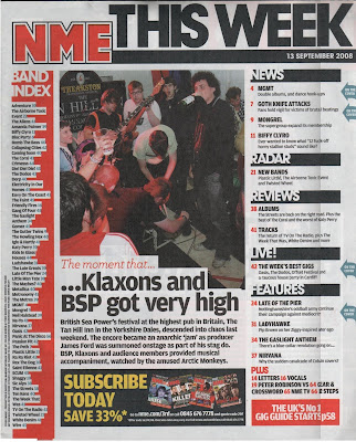
The logo is again displayed in the top left corner and the colour scheme is kept the same for continuity. The main headline is 'this week' with the date underneath. This tells us it's a weekly magazine and it is up to date with all the latest music news.
The contents itself is down the right hand side so it is easy to see from a turn of a page.It is separated by different headings which are white on a black background to stand out. But the pages aren't in order to fit into these headings which I think is a weak point in its layout. There are also blue arrows which stand out on the far right which point to the article mentioned on the cover to help readers find the articles they are looking for. There is also a band index in a red box to pull attention towards it. This makes it much easier to find the bands you like and see what page their on.
In the middle of the page there is a smaller story from the week with a small paragraph of writing and a bigger picture which is in the center of the page. The separates the contents and band index and also splits up the rest of the writing. The article is a first impression of what music artists are in the magazine and what type of stories they cover. It is set out like any article in the magazine with a headline which attracts the audience to read the article without giving much away.
There is a red box in the bottom right corner which advertises the magazine and make it seems reliable, and gives the page number of the 'UK's no 1' gig guide. Finally there is a advertisement for a subscription along the bottom. It is in yellow which doesn't follow the colour scheme and helps it stand out on the page.
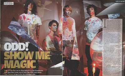
 The main image dominants the double page spread.The band are wearing a plain white t-shirts and jeans splattered in paint. This shows the band can be messy but creative and shows they are fun. The paint also makes them stand out from the rest of the white scene which represents that they are unique. The props are of random white shapes which show the band is random but again creative. Overall the image gives a creative and slightly psychedelic vibe which reflects the bands music.
The headline again suggests they are a unique and 'odd' band but the heading says this is a good thing. The introduction underneath builds up the band as experimental and daring. This is said to intrigue the reader and make them want to read on and see what music they are making.
The main article is on a white background to make it easier to read and also the white box attracts attention to it. Other features are the white box in the top left corner which identifies the band members so the readers can see who is who in the band. Finally there is a the band name in the top right corner which clearly tells the reader which page of the magazine they are on.
No comments:
Post a Comment