 The second magazine I am analysing is Kerrang! magazine. Kerrang!'s ideology focuses on rock bands, and usually metal. It has a mix of old classic bands and new upcoming bands which makes it appeal to a wider audience.
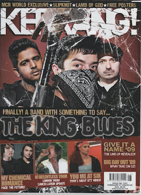
The masthead is the magazine logo and has been partly obscured by the main image, this suggests the magazine is well known and popular. The logo is a bright white compared with the dark colours of the main image so stands out and will catch the buyers attention.
The main image is of alternative rock band The King Blues and for this photo are made to look intimidating and rebellious. This representation is created by the band wearing black, especially the black bandanna covering his face and the hammer prop. The hammer makes the band seem violent and rebellious which is empathised by having a broken glass effect on the splash. The band are looking directly into the camera which involves the reader and catches their eye.
The urban rebel portrayal is continued on the main cover line font. It has been made to look like graffiti and is again in black. The tag line 'Finally! A band with something to say...' suggests there is a reason the band is so rebellious and they have a message. The other cover lines fill the bottom of the page and some have smaller images along with them. I think this is because the band on the main image is a new band many might not have heard of yet whilst the bands mentioned on the smaller cover lines are more popular, so the audience will recognise the bigger bands and it may persuade them to pick up the magazine. There is also a banner across the top with more bands listed to attract fans of those bands and attract a bigger audience.
The bar code in the bottom right corner includes the price, issue number and website. All the magazine information is in the same place making it easy to find.

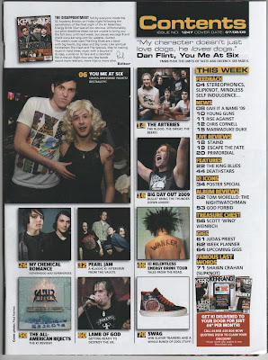
The title 'Contents' is in the top right corner of the page with the issue number and date easily displayed on a black background. The colour scheme is white, black and yellow and the yellow and black are used together and help make headings and page numbers stand out. The actual contents is down the right side of the page so it is easy to flip the page and see clearly what is inside. The pages are under headings to split the contents up and make it easier for the reader to find the pages their looking for.
The page is image dominated with pictures of the main rock bands covered in the magazine and include the page number and caption explaining why they're in the magazine. The use of lots of images make the writing less daunting to read, which could say something about its target audience.
There is also a small letter from the editor with a signature which again makes the magazine seem more personal. Underneath the title is quote from a band in the magazine and page number. The quote is used to get the audiences interest in the article and band. Lastly there is a subscription advertisement in the bottom corner. This in red which stands out from the rest of the colour scheme to grab the readers attention and persuades them to subscribe.


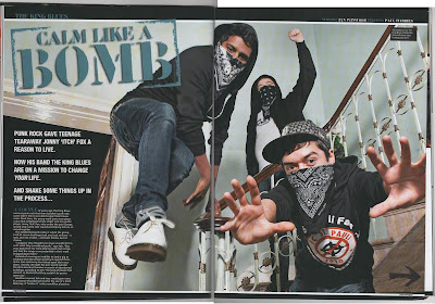
The double page spread is mainly image. The photo has been taken from a low angle which makes the band look powerful and dominant. They are looking directly into the camera to catch the readers eye and their poses look intimidating and confident. Their costumes are black and they have bandannas covering their faces which make them look rebellious and give them an urban look. The setting is in a house which looks old and run down which again gives the raw urban feel to the band.
The title has been made to look like a stamp which continues the graffiti effect on the front splash. The colour is a dark blue but it still stands out from the black background and matches one of the bands dark blue jeans. The title 'calm like a bomb' gives the impression that the band is loud and violent.
The start of the article is in the bottom left corner in front of the black background so the white writing stands out as much as possible. The introduction is in a bigger, bolder font and build up the band as new and exciting to persuade audience to continue reading the article. The introduction says there is more to the band than their rebellious image and they have an important message to get across and they will do this in the full article.
There is a small black box in the right hand corner of the image which tells us the names of the band members so the audience can see each member individually and become familar with them. The bands name is across the top left so the reader can easily tell which band it is and what page they are on. Finally there is a black arrow in the bottom right corner which tells the reader the article is continued on the following page.
No comments:
Post a Comment