My music magazine uses forms and conventions of the magazines I analysed for my research and planning. In my research and planning I analysed three different music magazines which were The Word, NME and Kerrang to establish the conventions and features in them to use in my own music magazine. For my front cover I included a small ear in the top right corner box which I used from NME and The Word magazine. I have all the conventions which are seen on the front splash of all music magazines I analysed to make sure my magazine looks professional. My masthead stands out from the main image background as with other music magazines with its big font size and bold colour. My cover lines are displayed down the left hand side of the magazine so when it is displayed on a shelf the names of other bands will be clearly seen to attract a larger audience.
I designed the editors letter based on The Word for my contents page. The letter from the editor makes the magazine seem more personal and friendly as the editor is directly speaking to the reader. I also used the main image on the contents page from NME to complete my own contents page. My contents index is clearly displayed and set out into sections to make it easier to read and for the audience to find what they are looking for.
I used the idea of a main image taking up both pages for my double page spread from Kerrang and NME which is a convention of double page spreads. It was mainly inspired by NME because I used a slightly transparent box for the text as NME did for their double page spread. The article is set out in columns which is another convention of magazines.
The ideology of my music magazine is to focus on new upcoming bands so the social groups it represents are people who are very up to date with the latest music and enjoy searching for new bands. The ideology is that the music is the most important thing and not the bands image. This is made clear from the choice of bands I have referred to as they are all new bands that only people who are keen on new music will have heard of. The social group will be primarily young people as they most commonly go to small gigs and typically most interested in upcoming bands. The magazine represents this social group as passionate about music and that they enjoy going out and having fun with friends.
Smaller and more independent media institutions may distribute the magazine as bigger mainstream institutions focus on profits so want big bands to feature. Independent institutions are more likely to think of the quality of music they are covering rather than just how big the band is at that moment in time. I would choose the publisher Development Hell LTD to distribute my magazine. They are UK based independent magazine publisher who own and distribute such magazines as The Word whose genre is classic rock and entertainment and Mixmag which covers dance music. I feel like this would be the right institution to choose as they have experience with music magazines but haven’t done the indie rock genre which my magazine covers so it opens up a new market for them and potential for profit.
My main target audience will be young adults and students aged between 16-25, as students have more knowledge of new bands and are more likely to attend small gigs and concerts. This means they will be more interested in the music scenes described in the magazine and explore them further. Young adults also have the element of disposable income and as they are all mainly music fans they will spend their income on music magazines. The audience share the same ideology as the magazine that music is the most important thing with bands and artists. The target audience is for both men and women as both can be just as passionate for new music which is what the main focus of the magazine is. The magazine will help build a community around supporting local bands so the audience will feel that the magazine cares about smaller bands which will make the audience feel like they can trust the magazine. If fans care about their favourite bands they will care about the magazine which promotes them.
I attempted to attract my audience on the front cover through mise-en-scene by using bright colours which will make it stand out on a shelf as most music magazines use a lot of black and darker colours. The masthead stands out the most as it is on a white background and has a bold outlining so people will remember the name of the magazine. I think my magazine will appeal to my target audience from the bands mentioned on the front cover and on the contents page. My cover artist’s genre is electro rock which is popular within the indie scene at the moment and so this shows the magazine is up to date and fresh.
I have learnt to use Photoshop whilst making my college and music magazine which I have used for editing my images and creating my contents page and front cover. I learnt how to use layers so images and text can overlap and create gradient effects for the background which make it look more professional. For my double page spread I used Microsoft publisher as it was easier to get the right dimensions and it was more suitable as the double page spread is mainly text.
From my preliminary task I learnt that I need to plan where everything is placed on the page in advance as for my college magazine I just put all the text around the image where it would fit. With my music magazine I thought more about my main image and where it would fit in relation to everything else when I took the picture. I used my college magazine to practice using Photoshop so when it came to my music magazine I could use the tools easier and to a greater effect. I also learnt to manage my time better and not leave everything to last minute which I am not doing with my music magazine. From the preliminary task I learnt about the conventions of magazine covers and the terminology to use so it could use it more naturally when it came to my main task and was used to analysing front covers of magazines for it.
Thursday, 25 March 2010

Thursday, 18 March 2010
Final Double Page Spread
 This is my double page spread for my music magazine. I have tried to keep the same colour scheme as the rest of the magazine with the page number and heading in the top left corner. Apart from that I have kept the colour at a minimal so it is easy to understand and the main image still stands out. The black and white also stand out more against the dark background and white text boxes. I have put the text in white text boxes but kept then fairly transparent so the bright white doesn't take attention away from the darker image and make it look unprofessional.
The main image of the artist is on separate page which is a usual for the double page spreads I have analysed. But my image also takes up both pages but only one has the artist on so the writing can be put on the empty side. I have darkened the background on photoshop as it is unimportant to the image and makes it easier to see the white headings. I have also made the artist brighter so she stands out more against the black backdrop. I have also included a caption in the top left corner which has to do with the focus of the article so it does not look like the image is there randomly.
Tuesday, 16 March 2010
Double Page Spread Photos
I was unhappy with my pictures for the double page spread so I took some more at the weekend. I made from landscape so they can cover the full double page spread and text can be written over the top of it. To do this I have kept Lydia to the left of the picture so the right side is empty so text can be clearly displayed without blocking anything. I will be using the second picture as the first one becomes too blurry when larger so it would look unprofessional and would reflect my music magazine. The second one is closer up so she will take up the full left side as she is the main focus of the article and it is not blurry so is the most suitable.


The images connotate that she is relaxed and a 'normal girl' even though she makes popular music which is also portrayed in the article. She is looking directly into the camera to show she is confident and happy with what she is doing.


Friday, 12 March 2010
Final Contents Page
 I have kept the same colour scheme as the fron cover but used mainly blues instead of purple so it isn't excalty the same. I put all the elementsof a contents page together including a big image, letter from the editor and subscription box. I have divided the actual contents into different sections to make it easy for the audience to find what their looking for. I have included the page number which corresponds to the main image which advertises the page and the rest of the magazine. The letter to the editor makes the magazine more personal and makes it seem friendly and welcoming. The subscription box is in a bold red which makes it stand out from the rest of page so the audience will notice it more and it will persuade them to subscribe.
Final Front Cover

Here is my final front cover. I have altered the background of the main image to make it look more professional and it still matches my colour scheme. I have all the features of a front cover of a music magazine like a masthead, main and smaller coverlines, date line and also website and price.
I have kept the same font throughout so i doesn't look too messy and have spaced out the different coverlines so the cover looks neat and the information is clearly displayed. I have made my image bigger so it takes up the most room and is the main focus of the cover as before the masthead was the first thing I noticed when I looked at the magazin cover.
Friday, 18 December 2009
Rough Final Front Cover
 Here is my final front cover for my music magazine. I have included all the conventions of a music magazine front cover such as a masthead, coverlines, slogan, barcode and others. I have chosen a simple colour scheme and used it in the font and my main image. I have also kept the same font so the magazine looks simple and neat.
 For my final cover I want to change the background using photoshop and maybe make the image slightly larger so it takes up somemore room at the top of the page
Thursday, 17 December 2009
IT Drafts


Here are my IT drafts for my three pages. I now know how I am going to make my final front cover and contents page and have chosen the photos.I have only shown my main image photos so far but I know what images I am using for my smaller stories on the front splash and contents page. All the images I am using are my own which I have took at various concerts. I am confident about where I am placing things like cover lines and bar codes. But I am still unsure how I am setting out my double page spread. I need to choose a final image and a headline which matches the representation of the artist I have created on the front cover.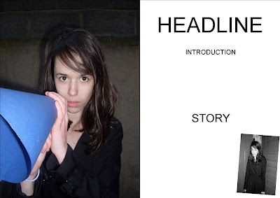
Monday, 14 December 2009
Costume and Props
My model is wearing casual clothes to show that her music is the most important thing. This shows the ideology of the magazine and shows the audience that is isn't targeted at a mainstream pop music audience. Lots of commercial artists wear unusual costume but my music magazine covers more alternative artists. Her down to earth costume reflects this. The clothes are casual but also in fashion and would be associated with indie-artists as the smart 'retro' fashion is now stereotypical of indie artists represented in other magazine and media texts.

The only prop I have used is a megaphone I made myself out of card. I used the dark blue colour as it stands out from the background and matches her jeans. It also co-insides with the colour scheme of the magazine.

Photos

This image is most likely to be on my front cover. I have already cut the image out by using photoshop.The pose shows she is confident as she has her hand on her hip. The megaphone is used to show she is loud and wants to get her message across. I have also took other photos which I will be using as my main image on my double page spread but I haven't decided which to use yet.
But I have decided which I will be using for my smaller image on my double page spread. I will be using the photo where she is standing against a brown garage door. This looks like it is an earlier picture form a different photo shoot and gives an urbanised feel. This shows she has worked her way up as an artist, starting on the street and now being on the front of a magazine.


Friday, 11 December 2009
Draft 2
 These are my second drafts for my music magazine. I haven't altered the front cover much but drawn it in more detail.
My contents page follows the same colour scheme except for the subscription box which makes it stand out. I have included things seen in most contents pages for example the letter from the editor and images.
My double page spread is mostly image like the ones I have analysed and I have included a smaller image as well. I haven't drawn this on in as much detail as I am still unsure about what the main image will be and the title of the article.


Wednesday, 9 December 2009
Draft 1

Here is my first draft for the front splash of my music magazine. I have included all the features fond on a front cover like the masthead, date line, cover lines e.t.c. I have included bands which fit the genre and target audience I am aiming for.
The artist on the main image will be holding a megaphone to show that she is loud and confident. She will be looking directly into the camera to grab the readers attention. She also has her hands on her hips to show she is strong and in control. In my next draft I will make the main image bigger so it takes up more room as there is a lot of empty spaces especially around the bar code.
When do the next draft I will put more detail into it and I also might move around some cover lines and the smaller image. I will also do a draft for my contents page and double page spread.
Thursday, 3 December 2009
Moodboard

I have made a mood board to help me plan my own music magazine drafts. I've chosen different colour schemes and images which relate to music. I have chosen two pictures and a logo of music artists which co-enside with the music genres I will be representing. On the picture I have wrote some key words of the photograph and how it portrays the artists.

Monday, 30 November 2009
Name and Logo
 I have come up with four different names for my music magazine, each with their on logo. I tried to come up with names that I will choose Siren as my final magazine name because it signifies that the magazine covers loud music, and the siren alerts the reader to the upcoming bands. I may also change my tagline to 'Wakeup to the new music scene'
Sunday, 29 November 2009
Target Audience

I have made my decision on the target audience for my magazine, overall they will be young students who regularly go to music gigs. This is a big target audience as most students are into music so want to be kept up to date with the latest music trends. I will be pricing my magazine at £2.20 as it isn't expensive for the average student and it will be a weekly magazine. I want to focus my magazine on new upcoming artists rather than classic bands, and because of this I won't focus on any bands before the 1900's. I also want to cover upcoming artists but readers may not have heard of them yet. My magazine will have to mention some bigger bands so people will buy the magazine but I will keep them modern and within the genres mentioned in my reader profile.
Saturday, 21 November 2009
Analysis 3 - NME
 The final music magazine I am analysing is NME magazine. NME's ideology covers old and new alternative music. But they mainly focus on indie rock as well as covering genres such as dance and hip hop. The magazine is targeted at the mainstream audience of 14-25's and has a wide appeal as it covers many genres.
The masthead is the title and logo of the magazine and has the biggest font on the page to stand out the most. It is in a bold red surrounded white which surrounds each letter. This emphasises and makes it stand out further. This also sets the colour scheme of red, white and black.
The main image is of the indie-electro band Late of the Pier and this photo makes them look creative, confident and fun. They are looking directly into the camera, like in my other analysis's, to engage the reader and show their confidence. The band are covered in paint which suggests they are creative and also shows a fun side to them. The paint could also show they are not afraid to break the rules and get dirty, which is reflected in their alternative music.
The main cover line states the name of the and clearly in black against a white background to make it stand out more. The individual letters on the cover line are placed separately and aren't in a straight line which again shows the band are fun and aren't afraid to go against the usual format. The introduction tells the reader what genre the band are so they know what to expect and if it appeals to them.
The other cover lines are positioned at the top of the page above the magazine title. The banner across the top is about Oasis and the font is nearly as big as the font on the main cover line. This is because Late of the Pier are a largely unknown electro band so it may put readers off. The mention of Oasis, a well known classic indie band, it will persuade regular indie fans to buy the magazine. There is also a small image of one of the main band members to attract attention to the cover line. There is another cover line with an image in the top right corner in a red box which makes it stand out from the rest of the splash. This story shows that the magazine doesn't just cover music artist but other music related news stories.

The logo is again displayed in the top left corner and the colour scheme is kept the same for continuity. The main headline is 'this week' with the date underneath. This tells us it's a weekly magazine and it is up to date with all the latest music news.
The contents itself is down the right hand side so it is easy to see from a turn of a page.It is separated by different headings which are white on a black background to stand out. But the pages aren't in order to fit into these headings which I think is a weak point in its layout. There are also blue arrows which stand out on the far right which point to the article mentioned on the cover to help readers find the articles they are looking for. There is also a band index in a red box to pull attention towards it. This makes it much easier to find the bands you like and see what page their on.
In the middle of the page there is a smaller story from the week with a small paragraph of writing and a bigger picture which is in the center of the page. The separates the contents and band index and also splits up the rest of the writing. The article is a first impression of what music artists are in the magazine and what type of stories they cover. It is set out like any article in the magazine with a headline which attracts the audience to read the article without giving much away.
There is a red box in the bottom right corner which advertises the magazine and make it seems reliable, and gives the page number of the 'UK's no 1' gig guide. Finally there is a advertisement for a subscription along the bottom. It is in yellow which doesn't follow the colour scheme and helps it stand out on the page.
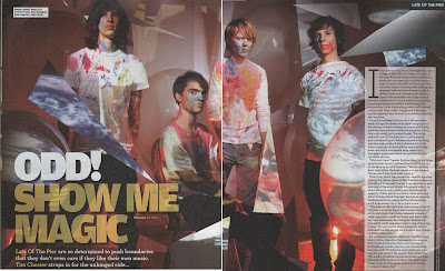 The main image dominants the double page spread.The band are wearing a plain white t-shirts and jeans splattered in paint. This shows the band can be messy but creative and shows they are fun. The paint also makes them stand out from the rest of the white scene which represents that they are unique. The props are of random white shapes which show the band is random but again creative. Overall the image gives a creative and slightly psychedelic vibe which reflects the bands music.
The headline again suggests they are a unique and 'odd' band but the heading says this is a good thing. The introduction underneath builds up the band as experimental and daring. This is said to intrigue the reader and make them want to read on and see what music they are making.
The main article is on a white background to make it easier to read and also the white box attracts attention to it. Other features are the white box in the top left corner which identifies the band members so the readers can see who is who in the band. Finally there is a the band name in the top right corner which clearly tells the reader which page of the magazine they are on.
Friday, 20 November 2009
Analysis 2 - Kerrang!
 The second magazine I am analysing is Kerrang! magazine. Kerrang!'s ideology focuses on rock bands, and usually metal. It has a mix of old classic bands and new upcoming bands which makes it appeal to a wider audience.
The masthead is the magazine logo and has been partly obscured by the main image, this suggests the magazine is well known and popular. The logo is a bright white compared with the dark colours of the main image so stands out and will catch the buyers attention.
The main image is of alternative rock band The King Blues and for this photo are made to look intimidating and rebellious. This representation is created by the band wearing black, especially the black bandanna covering his face and the hammer prop. The hammer makes the band seem violent and rebellious which is empathised by having a broken glass effect on the splash. The band are looking directly into the camera which involves the reader and catches their eye.
The urban rebel portrayal is continued on the main cover line font. It has been made to look like graffiti and is again in black. The tag line 'Finally! A band with something to say...' suggests there is a reason the band is so rebellious and they have a message. The other cover lines fill the bottom of the page and some have smaller images along with them. I think this is because the band on the main image is a new band many might not have heard of yet whilst the bands mentioned on the smaller cover lines are more popular, so the audience will recognise the bigger bands and it may persuade them to pick up the magazine. There is also a banner across the top with more bands listed to attract fans of those bands and attract a bigger audience.
The bar code in the bottom right corner includes the price, issue number and website. All the magazine information is in the same place making it easy to find.

The title 'Contents' is in the top right corner of the page with the issue number and date easily displayed on a black background. The colour scheme is white, black and yellow and the yellow and black are used together and help make headings and page numbers stand out. The actual contents is down the right side of the page so it is easy to flip the page and see clearly what is inside. The pages are under headings to split the contents up and make it easier for the reader to find the pages their looking for.
The page is image dominated with pictures of the main rock bands covered in the magazine and include the page number and caption explaining why they're in the magazine. The use of lots of images make the writing less daunting to read, which could say something about its target audience.
There is also a small letter from the editor with a signature which again makes the magazine seem more personal. Underneath the title is quote from a band in the magazine and page number. The quote is used to get the audiences interest in the article and band. Lastly there is a subscription advertisement in the bottom corner. This in red which stands out from the rest of the colour scheme to grab the readers attention and persuades them to subscribe.
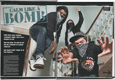
The double page spread is mainly image. The photo has been taken from a low angle which makes the band look powerful and dominant. They are looking directly into the camera to catch the readers eye and their poses look intimidating and confident. Their costumes are black and they have bandannas covering their faces which make them look rebellious and give them an urban look. The setting is in a house which looks old and run down which again gives the raw urban feel to the band.
The title has been made to look like a stamp which continues the graffiti effect on the front splash. The colour is a dark blue but it still stands out from the black background and matches one of the bands dark blue jeans. The title 'calm like a bomb' gives the impression that the band is loud and violent.
The start of the article is in the bottom left corner in front of the black background so the white writing stands out as much as possible. The introduction is in a bigger, bolder font and build up the band as new and exciting to persuade audience to continue reading the article. The introduction says there is more to the band than their rebellious image and they have an important message to get across and they will do this in the full article.
There is a small black box in the right hand corner of the image which tells us the names of the band members so the audience can see each member individually and become familar with them. The bands name is across the top left so the reader can easily tell which band it is and what page they are on. Finally there is a black arrow in the bottom right corner which tells the reader the article is continued on the following page.
Friday, 13 November 2009
LIIAR Spider Diagram
 I have made a spider diagram for LIIAR and where it appears in music magazines so I can incorporate it into my magazine analysis' and also think about my own music magazine. I think this has made it much easier for me to understand and use LIIAR and I have a clear idea of what they all mean and how they are used.
Friday, 6 November 2009
Analysis 1 - The Word
 The first music magazine I am analysing is The Word. The Word has an ideology where influential classic rock is important. This can be seen on the front splash with mentions of older rock bands so will attract an older audience. The main image on the front cover is a medium shot of John Lennon which takes up the whole background of the splash. The medium shot is used so he is instantly recognisable His face is in the top right of the cover and the main cover line and other cover lines are positioned around his shoulder which takes up the left third of the magazine. His outfit looks smart which makes him look intelligent as well, and his expression is self-assured without looking arrogant. This outfit and expression makes him look like a respected artist. Another reason why this picture has been chosen could be that his coat is black which helps display the white cover lines clearly and his top is red which corresponds with the title of the magazine. The colours black and red have been chosen as they match the colour scheme of the front cover and the bright red stands out against the black to grab the audiences attention. The picture is taken at a straight on angle and Lennon is looking directly into the camera, this straight-up shot engages the reader and would stand out with other magazines.
 The main image is not placed in front of the masthead as the magazine is not a recognisable name.
The masthead is in a bold red to stand out and has two tag lines. The first 'music magazine of the year' is placed over the masthead again to stand out and catch the audiences attention so that the reader will know it is the best music magazine. The second tag line 'Intelligent Life On Planet Rock' suggests the magazine is for older readers and not the mainstream audience. This is also reflected in the price of £4.80, as it is more of a niche market the price of the magazine has to be raised so the target audience is of a middle class background. There is also a smaller image in the top left corner and headline across the top which refers to the image, to advertise what else is in the magazine, and that it covers TV programmes and not just music.
The main cover line is placed next to John Lennon's face and has the word 'Lennon' in a big white font to show who the main image is of, and underneath it says why he is in the magazine. Not a lot of the story is given away in the main cover line but advertises it as a big important news story so this will persuade the reader to buy it. Unusually there is also the name of the journalist who wrote the story underneath the main cover line, this might have been done as the writer is a successful and famous music journalist.
The also cover lines are in the bottom left corner of the splash in a smaller white font. This helps split the writing up and doesn't attract attention away from the main image and masthead. On the bottom right more music artists are named to give more of an insight to what music the magazine covers and what is in the issue and to appeal to fans of the artists mentioned not just John Lennon fans. The red and white font is used to split apart the different names and balance out the use of red at the top of the splash.
 The contents page follows the same colour scheme as the front cover to keep continuity. There is a red masthead with the name of the magazine and the title 'contents page' so the audience know where the contents is. The date is also displayed bigger than it was on the front splash which makes it easier to see, so they know how recent the magazine is. There is another red banner at the bottom advertising the subscription to the magazine. The red makes it stand out and balances out the red used on the masthead.
The actual contents of the magazine is listed down the right hand side with stories mentioned on the front cover highlighted. This makes it much easier for the reader to find the stories they most likely bought the magazine for. Regular columns are highlighted in grey to make them again easy to find and splits up the contents column. The contents column is placed on the right hand side because if it was on the left it might be hard to read because it is near the canter page fold. Also if you were looking at the magazine on a rack you could flip the page and see everything that is in the magazine which may persuade you to buy it.
The images on the left all have to do with articles in the magazine and there is small print in between them showing what the page shows and what page it can be seen on. These pictures show that it is not just a music magazine and covers issues on politics which goes with their tag line 'Intelligent Life On Planet Rock'. There is also a caricature in the bottom right corner which is from one of the pages displayed in the contents. The image here splits up all the writing and references popular culture which again shows it is not just a music magazine and is up to date with the latest news.
The letter from the editor adds a personal touch to the magazine and the photo gives the reader an idea of who works on the magazine and can see them as real people who like what they're doing rather than just unknown faces doing their job. The signature at the end highlights the personal touch and the reader feels like they know the editor. This makes the reader more trusting in the magazine and believe its views on what music is good.
 The headline aims to interest the audience by creating a sense of mystery, and that the article is going to include unknown things about John Lennon so fans will read the article to find out what they are and why they are so strange. The headlineand introduction is in big black lettering and take up a third of the page to stand out. The introduction is in smaller writing but still much larger than the main article. This is so the reader can read what is included in the article without readingit all. The introduction also advertises the rest of the article by giving away some of the things mentioned in it and mentions it is all in a new book which is why the magazine is covering it now.
The main article is in a much smaller font which suggests there is a lot to read, but this will appeal to its target audience of older intelligent music fans. It is set out in paragrphs to split up the writing. In the bottom right corner is the magazine website which reminds the audience that they can go on the website for more information about the book and on Lennon.
The three image to the left are old black and white photos which look like they're from a family album. This makes the article more personal and gives fans a chance to see how his life was. Next to each image is details about what each photo is and then information about who is in it which gives a further insight into his early life.
On the right there is an image of John Lennon which fills the page. In the chosen image he is looking directly into the camera to engage the reader and is unsmiling which makes him look like a serious person. The photo looks almost like a passport style photograph and his face and glasses are the only thing which is in colour on the whole double page spread. This helps him stand out and the audience can easily understand that this is the main article. The photo is placed on a side like it has been dropped onto the page, and the same can be said for the images on the other page. This makes the photos look like a collage and makes them look like personal photos. In the bottom right corner is information about when and who took the picture and information about Lennon. The photographer, Andy Warhol is included because he is a famous artist so the picture seems more important, it also says it was taken on a polaroid which gives it a retro feel.
Key Concepts
When making my music magazine and college magazine front cover I have to recognise and use these five key concepts -
Language - the specifitic termnology used to describe the given subject, language is used alot on magazine covers for example the headline and masthead. When making my magazine I have to use language which corresponds with my target audience and music genre.
Institution - the organisation/s which produce the media texts. The institution has a purpose for creating the magazine and this will effect the content.
Ideology - a dominant set of ideas presenting peoples values and sterotypes for example that the good guys never kill.
Audience - the consumers of media. For my music magazine I must recognise the target audience, my magazine will be aimed at fans of a the chosen genre of music.
Representation - the media shows our society back to us and what our morals and values are. Magazines can tell us what we should be doing/liking and I need to think carefully about what I include in my magazine.
Language - the specifitic termnology used to describe the given subject, language is used alot on magazine covers for example the headline and masthead. When making my magazine I have to use language which corresponds with my target audience and music genre.
Institution - the organisation/s which produce the media texts. The institution has a purpose for creating the magazine and this will effect the content.
Ideology - a dominant set of ideas presenting peoples values and sterotypes for example that the good guys never kill.
Audience - the consumers of media. For my music magazine I must recognise the target audience, my magazine will be aimed at fans of a the chosen genre of music.
Representation - the media shows our society back to us and what our morals and values are. Magazines can tell us what we should be doing/liking and I need to think carefully about what I include in my magazine.
The Brief
Main task - Create the front page, contents and double page spread of a new music magazine. All images and text used must be orginal, produced by you - minimum of four images.
Subscribe to:
Posts (Atom)